Project overview
The product
Kids in Kitchen is a social good initiative sponsored by a local school, created to promote healthy life habits, starting from the food, which is one of the most important elements for our wealth.
Problems and goals
The app wants to communicate the importance of eating and cooking in a healthy way, leading the youngest people toward a major awareness about their wellbeing, what they eat and how they cook it.
Role and responsibilities
As UX Designer leader, I was in charge of the whole process: conducting interviews, paper and digital wireframing, low and high-fidelity prototyping, conducting usability studies, accounting for accessibility, and iterating on designs.
Understanding the user
User research
Kids in Kitchen primary users include primary and secondary school students who want to learn more about healthy habits in cooking and food properties for a healthy eating.
These users reside in urban and suburban areas, they have access to fast internet connection and are confident in using smartphone and technology in general.
Personas
One of our personas, Jude, is a 12-year old student with severe gluten allergy so he needs to pay attention to every ingredient present into the food he eats: for this reason is started reading all labels on food packaging and also became curious about cooking food on his own, so he can avoid any food that can be dangerous for his health.
User journey maps
The journey map created for our persona, Jude, revealed how helpful it would be for users to have a smart and usable app that helps them learning how to choose healthy food and cook them through simple recipes.
Starting the design
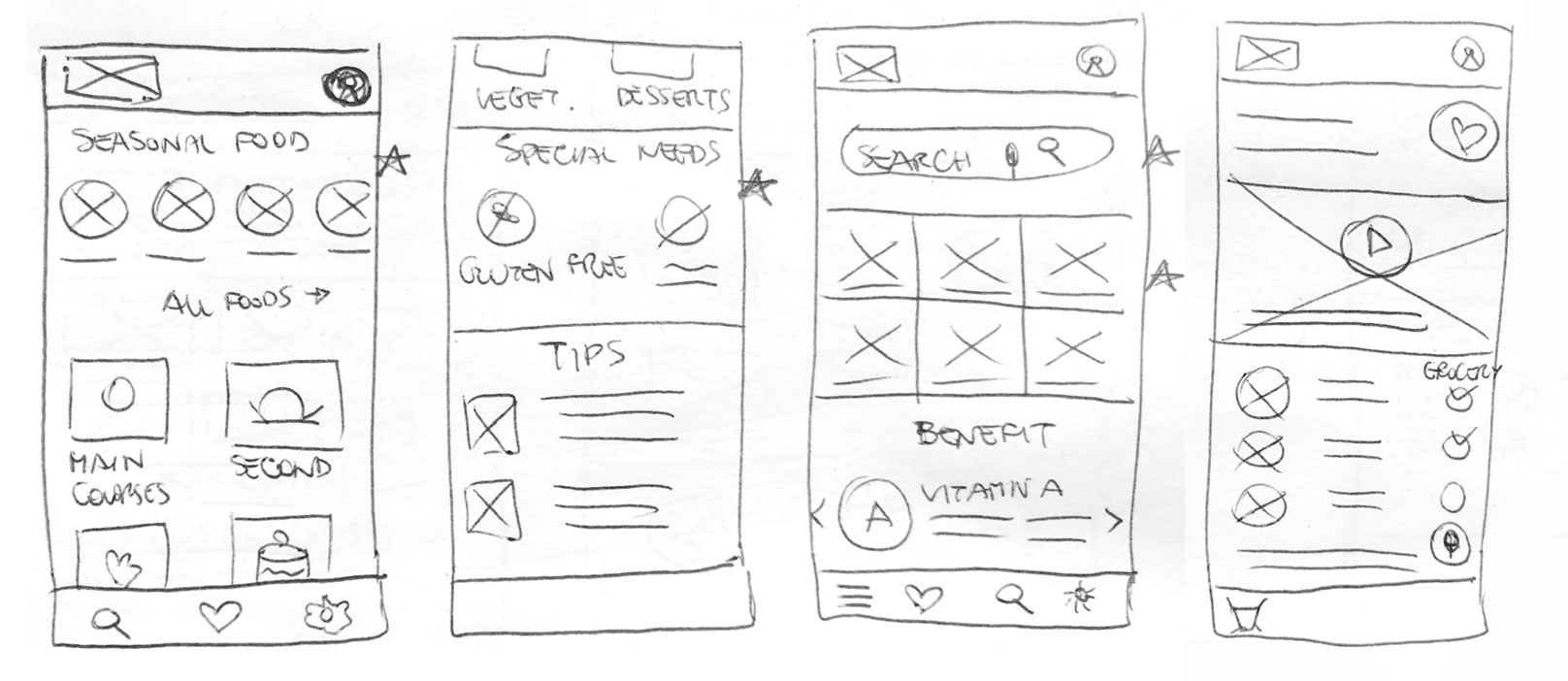
Paper wireframes
The first sketches of the main screens of the app on paper helped me understanding how the elements could address our users pain points.
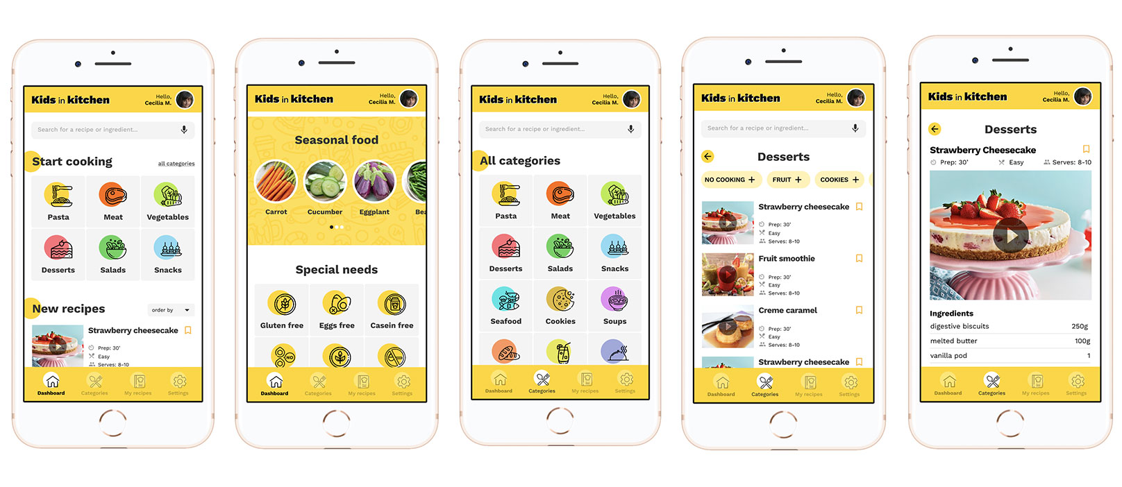
For the home screen, I prioritized a grid of recipe categories to drive the users towards their cooking needs.
Plus, I added another set of categories for special needs that help people with health issues.
Digital wireframes
As I move on with the digital design phase, I made sure to edit the screen designs on feedback and findings from the user research.
I added a voice search icon and video formats for the recipe, in order to address one of the main user needs: keeping its hands free while using the app, in order to use them for making the recipe!
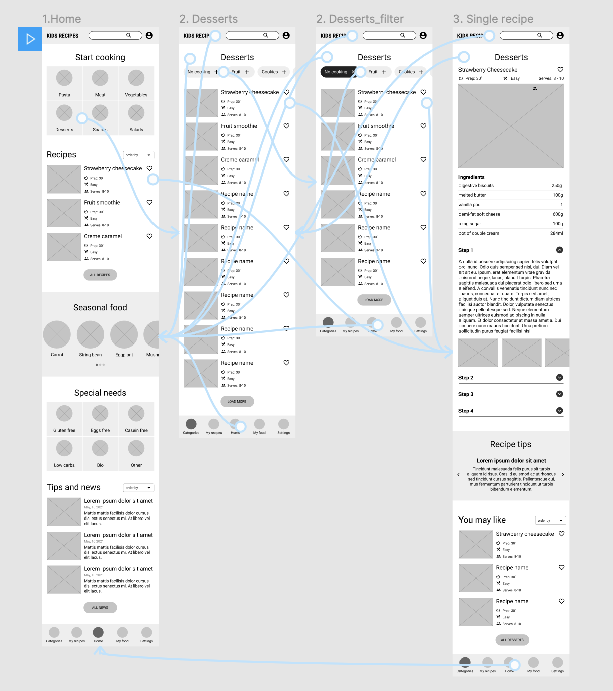
Low-fidelity prototype
The low-fidelity prototype I made in Figma connected the primary app pages such as homepage, category page and single recipe page: in this way the prototype could be used in a usability study with users.
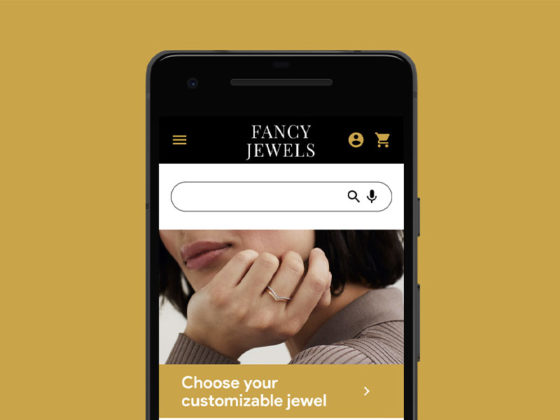
View the Fancy Jewel low-fidelity prototype.
Refining the design
Mockups
After the usability study, I used an Affinity Diagram to organize a few actionable insights I came up with.
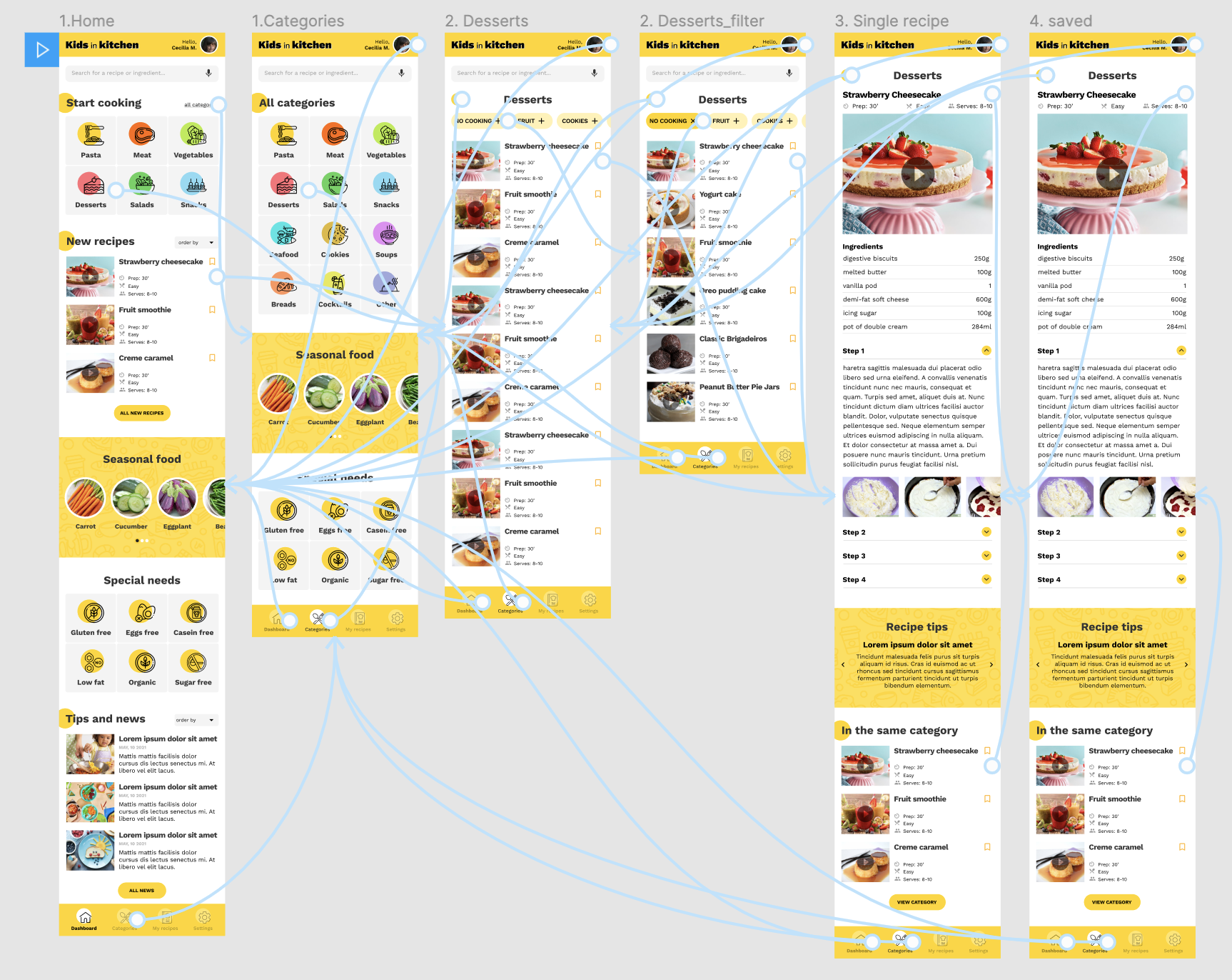
One of these was adding the chance to save recipe through a simple yet understandable icon, and add a tab in the tab bar to keep them saved.
Another tip was adding functions to avoid users using their hands while cooking, so I placed a vocal search and video formats for recipes.
High-fidelity prototype
The hi-fi prototype was revised in a few design sessions, and included some design changes revealed after the usability study: I added different colors for the main recipes categories and also a typography which is bolder and more readable.
View Kids in Kitchen high-fidelity prototype.
Accessibility considerations
Provided access to users who are vision impaired through adding alt text to images for screen readers.
Used clear icons and high-contrast colors to help the users navigate the main categories.
Used vocal search to speed up user search function and help people with gesture impairments.